
Project: Honeychild Ice Cream -Brand Identity & Packaging
Role: Sole designer — brand identity, packaging design, product photography direction
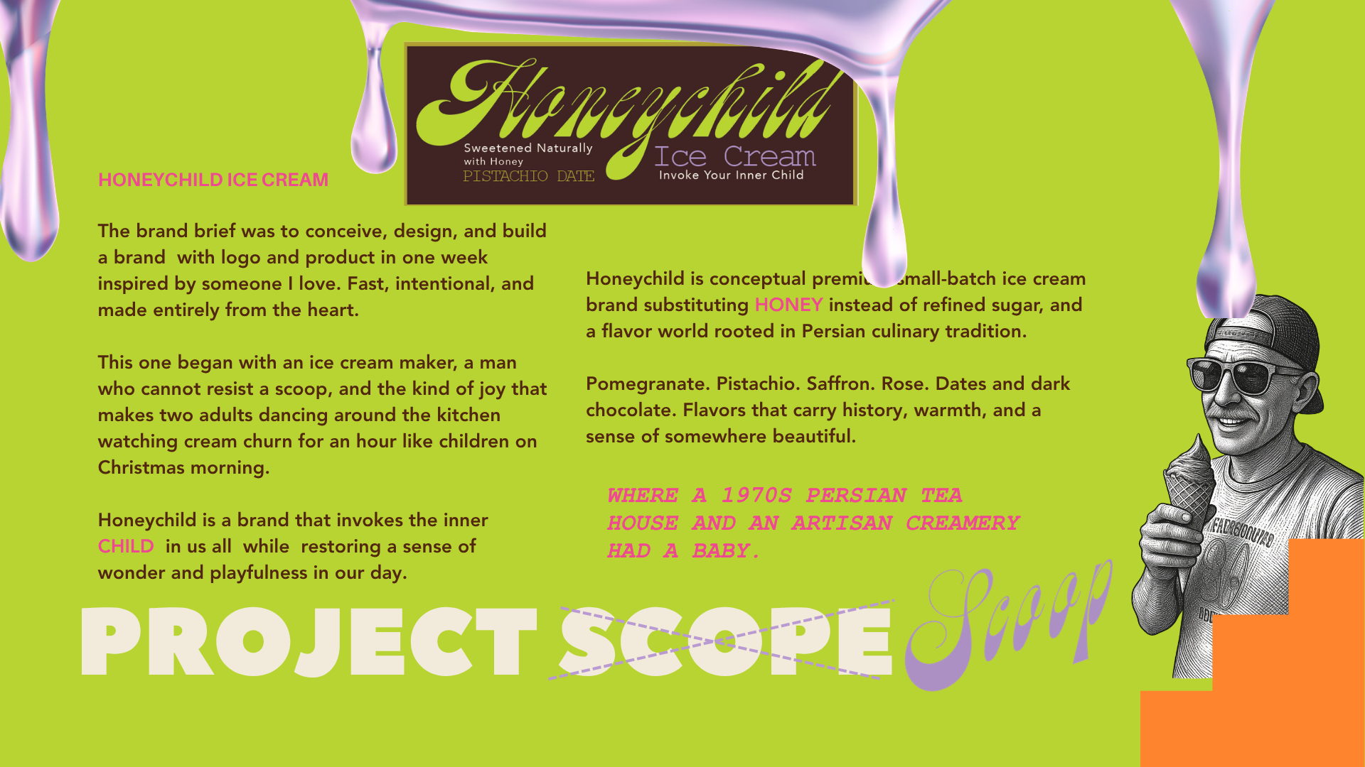
Honeychild is a naturally-sweetened ice cream brand built around flavor as storytelling — Pistachio Date, Saffron Dream, Pomm Rose — each one tied to a cultural or historical ingredient narrative rather than a generic flavor name. The design challenge was building a packaging system that could hold a distinct flavor identity for each product while staying instantly recognizable as one brand on a shelf full of competitors.
That meant a repeatable structure: consistent logo placement and type treatment across every pint, a color-coded system so flavors are distinguishable at a glance, and a mirrored ice-cream-scoop motif used as a lid pattern that ties every product back to the same visual language — playful, a little psychedelic, and memorable.
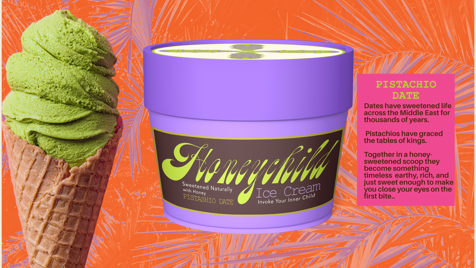
Pistachio Date pint — flavor-specific color story + cultural ingredient narrative
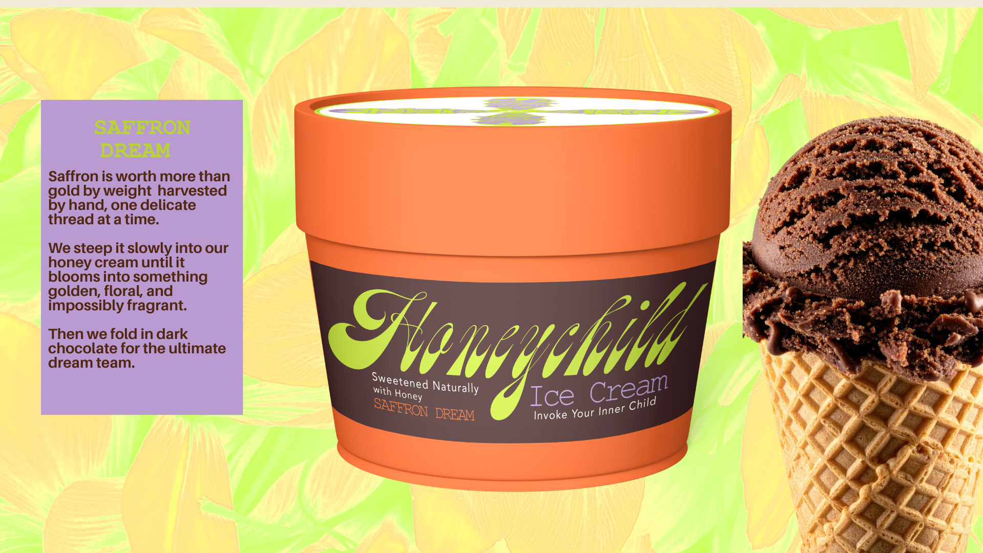
Saffron Dream pint — warm color differentiation on shelf
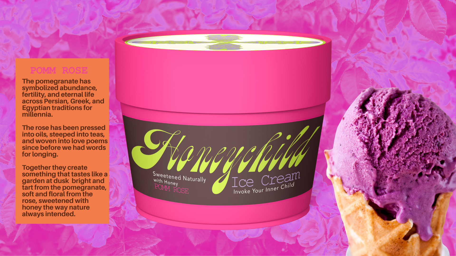
Pomm Rose pint — consistent label structure across colorways
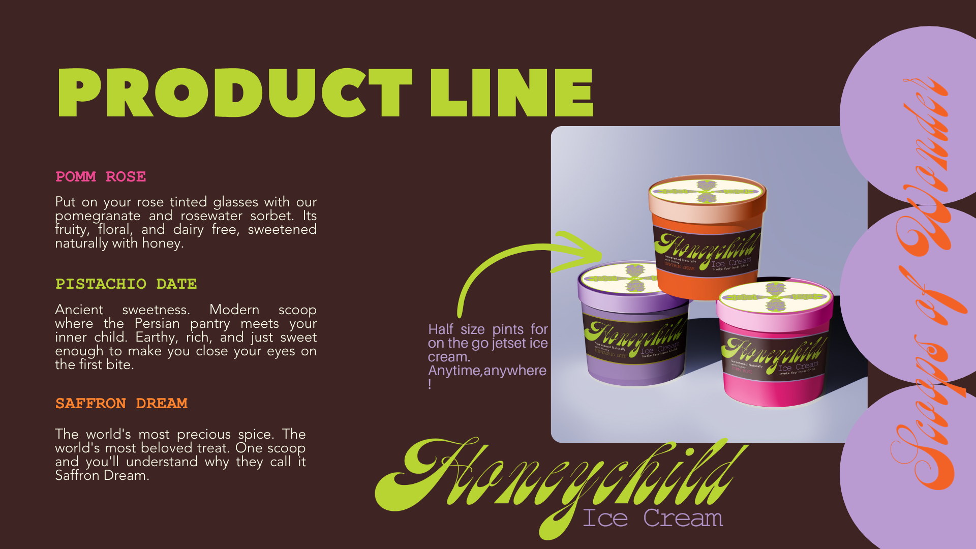
Product line overview — system holding across pint + half-pint formats
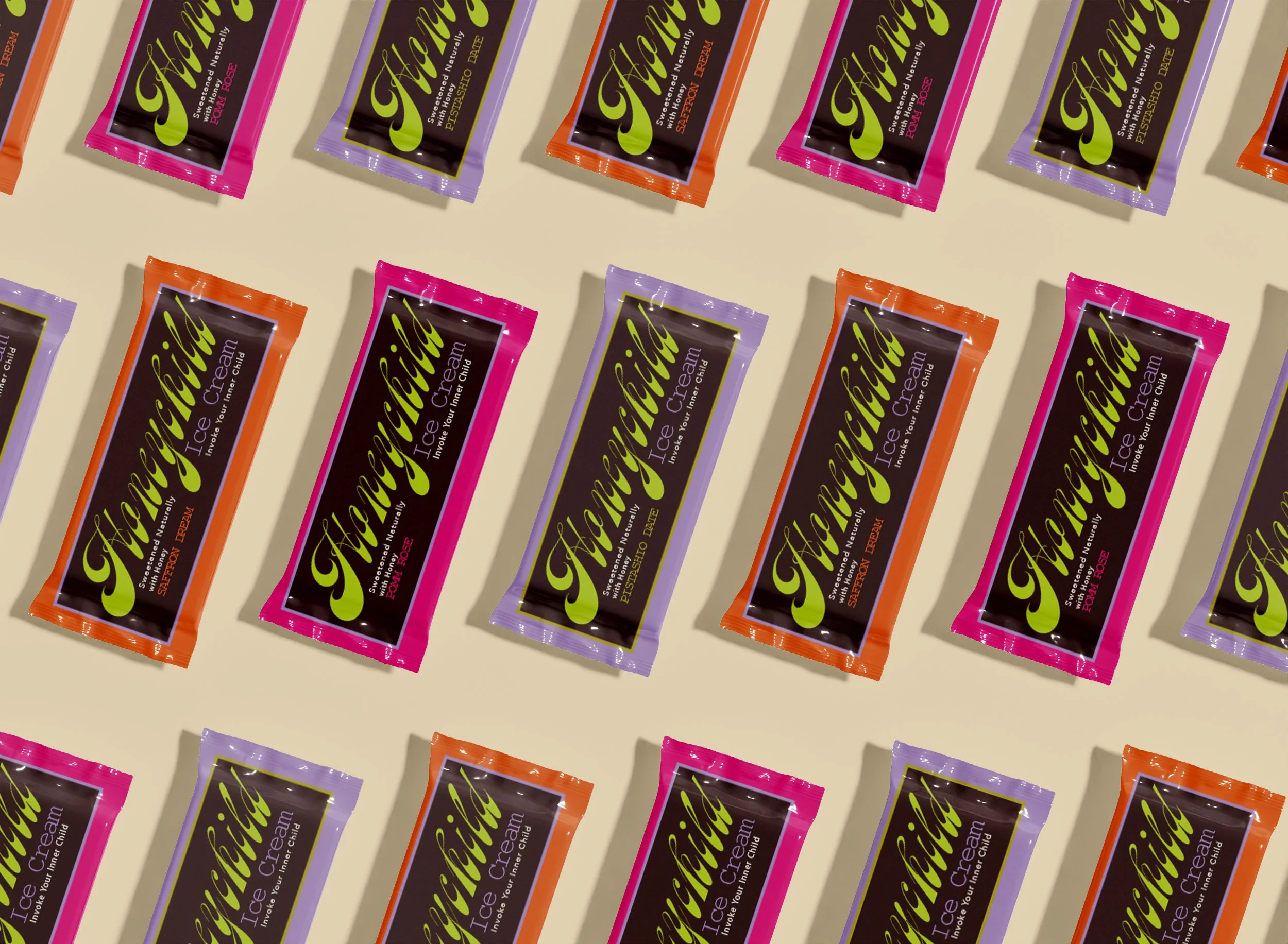
Wrapper pattern — brand system extended to grab-and-go format
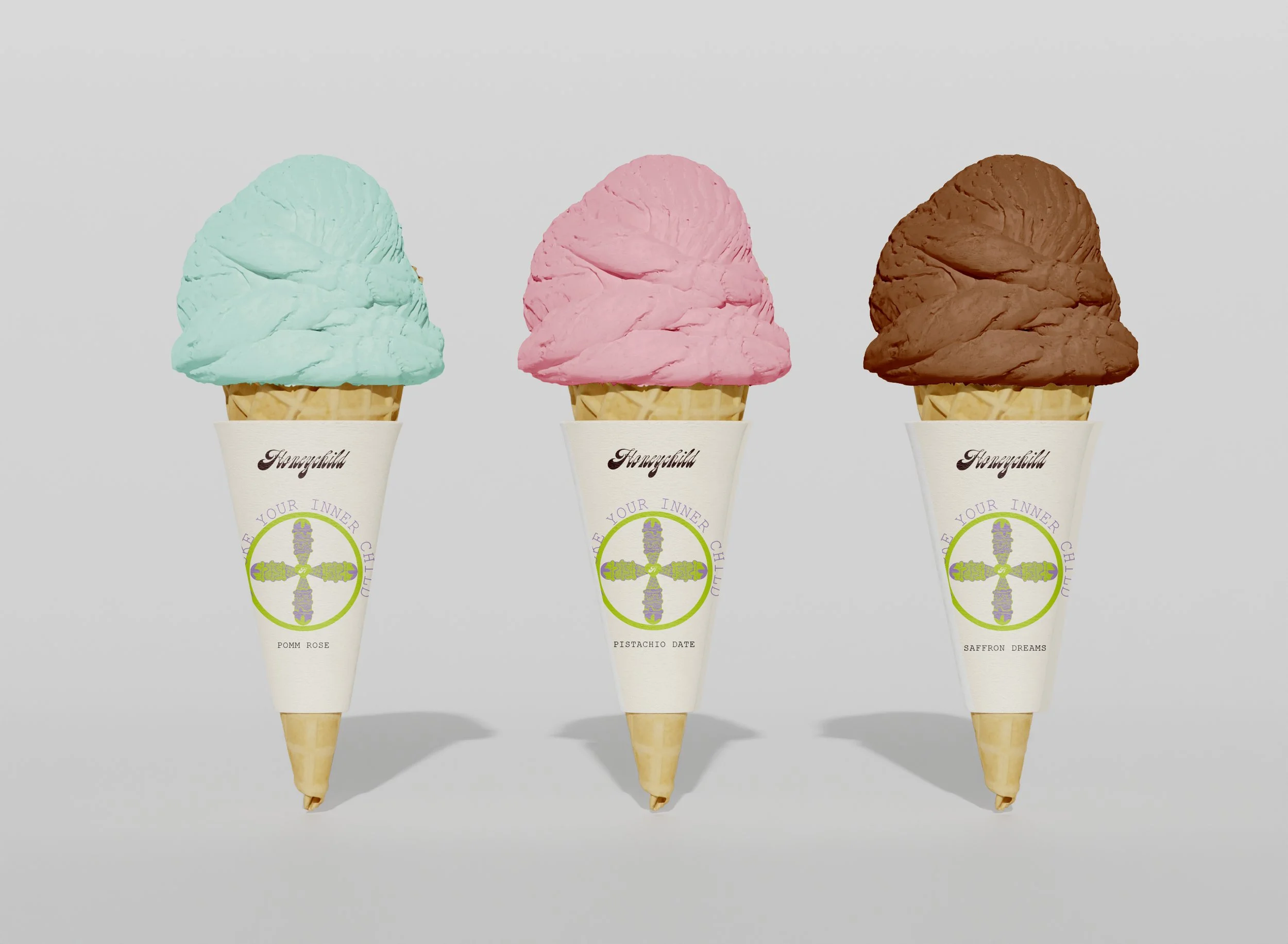
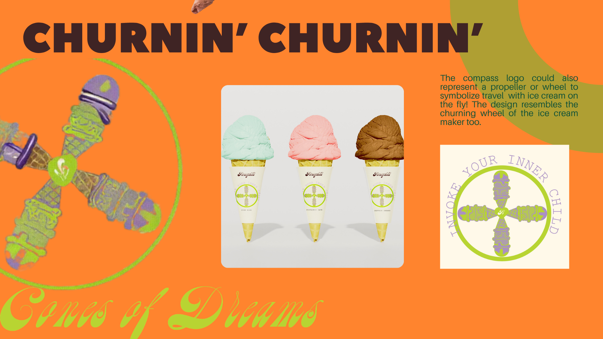
Cone mockups — logo/scoop motif tested at small scale

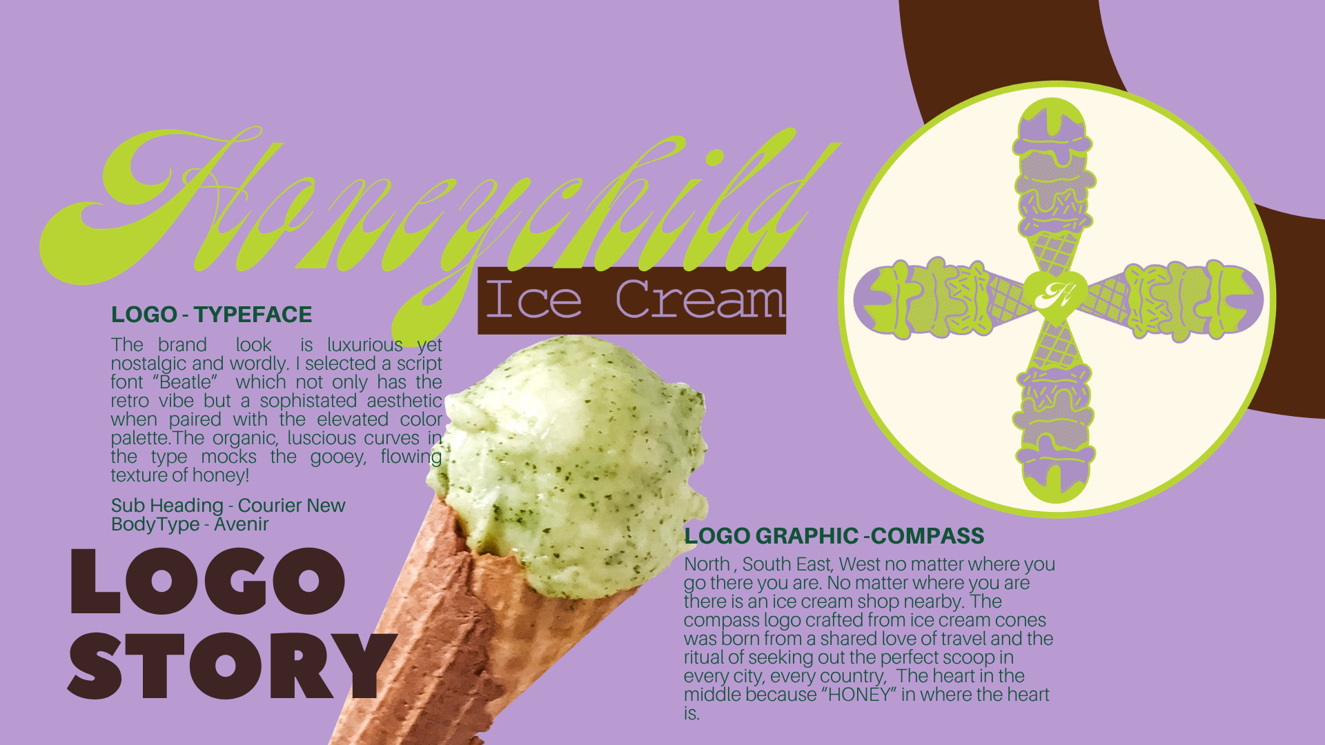
Logo mark detail — the mirrored scoop-and-cone as core visual signature
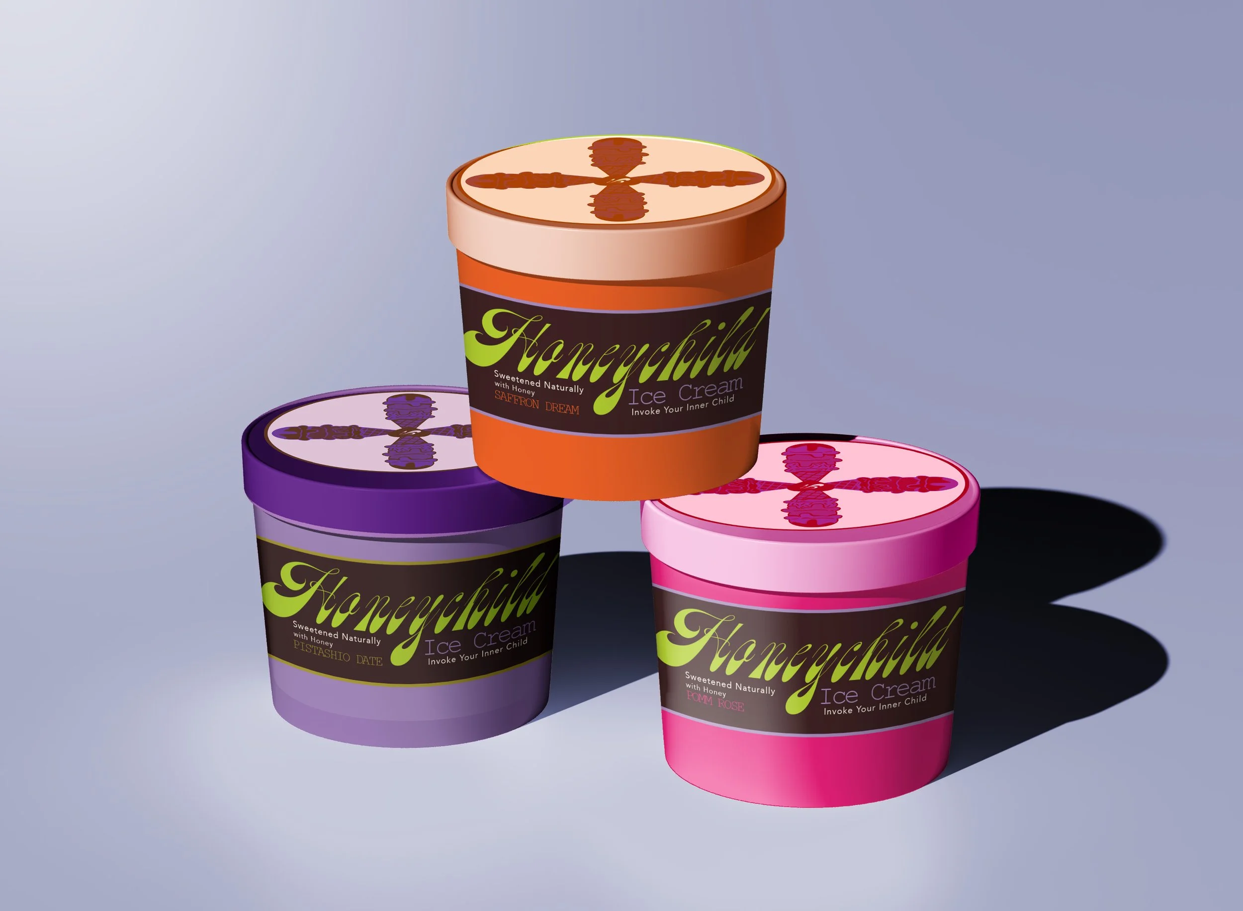
Full lineup shot — the complete system brought together