

Elegant Savage Skin Potions- Building Trust Before the Sale
Role: Sole designer and strategist — brand identity, UX/IA, packaging, product development, content, and photography
Elegant Savage launched in 2009, when "clean beauty" had no shared language and no built-in trust. The core design problem wasn't how to sell a product — it was how to build enough belief in an unfamiliar idea that someone would want to buy in at all.
That meant the entire experience, from homepage to packaging to product copy, had to do the work of education and trust-building before any transaction could happen. The site's structure reflects that: discovery and story come first, purchase is the smallest step in a much longer relationship.
This project spanned the full pipeline — from information architecture and site structure, to art direction and packaging (botanical, mirrored photography built to feel almost psychedelic), to product development, copywriting, and in-person community events that shaped what the digital experience needed to replicate at scale. The sections below walk through each layer of that system.
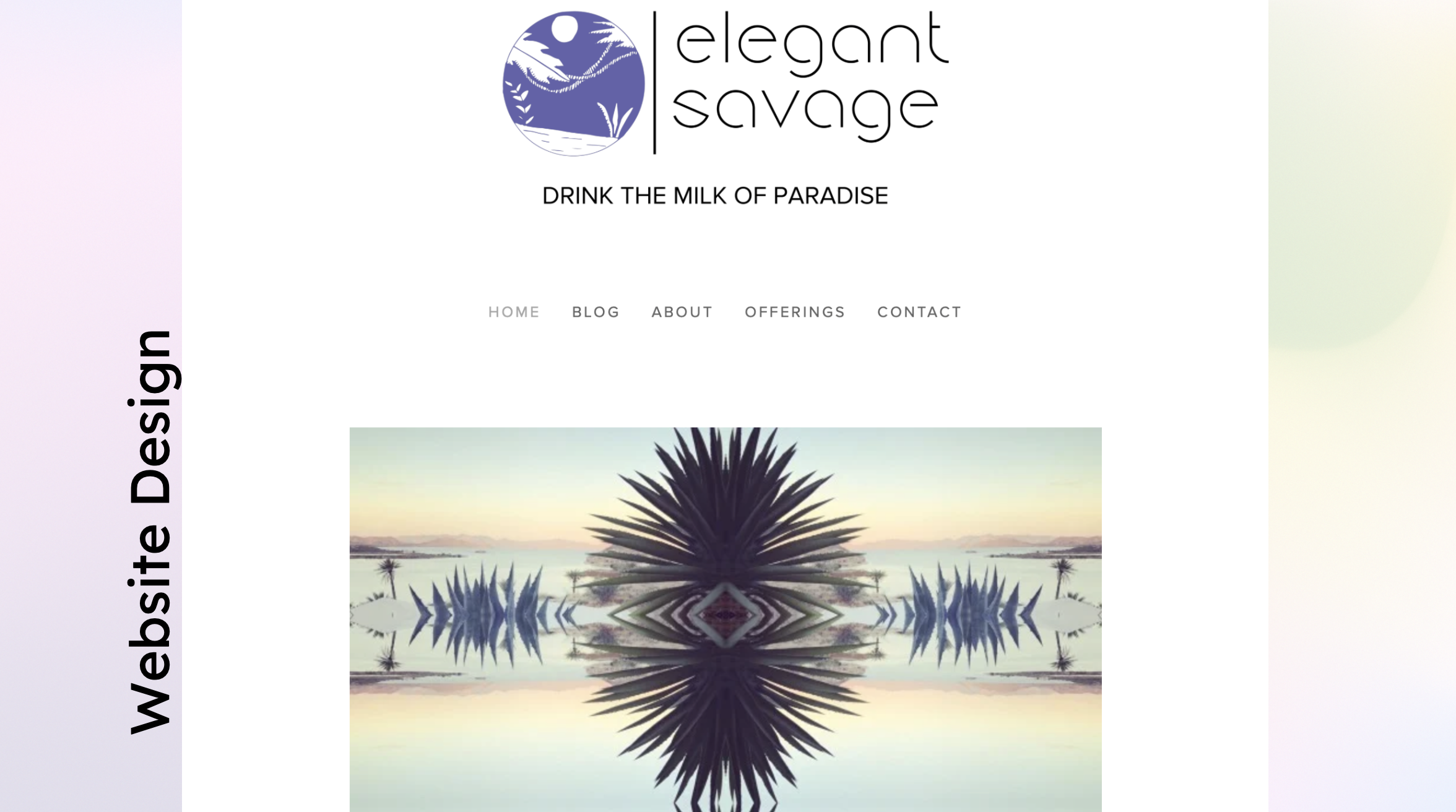
1. Homepage: The homepage's job was to earn trust before asking for a sale — leading with story and sourcing over product, since 'clean beauty' had just a small shared vocabulary in 2009.
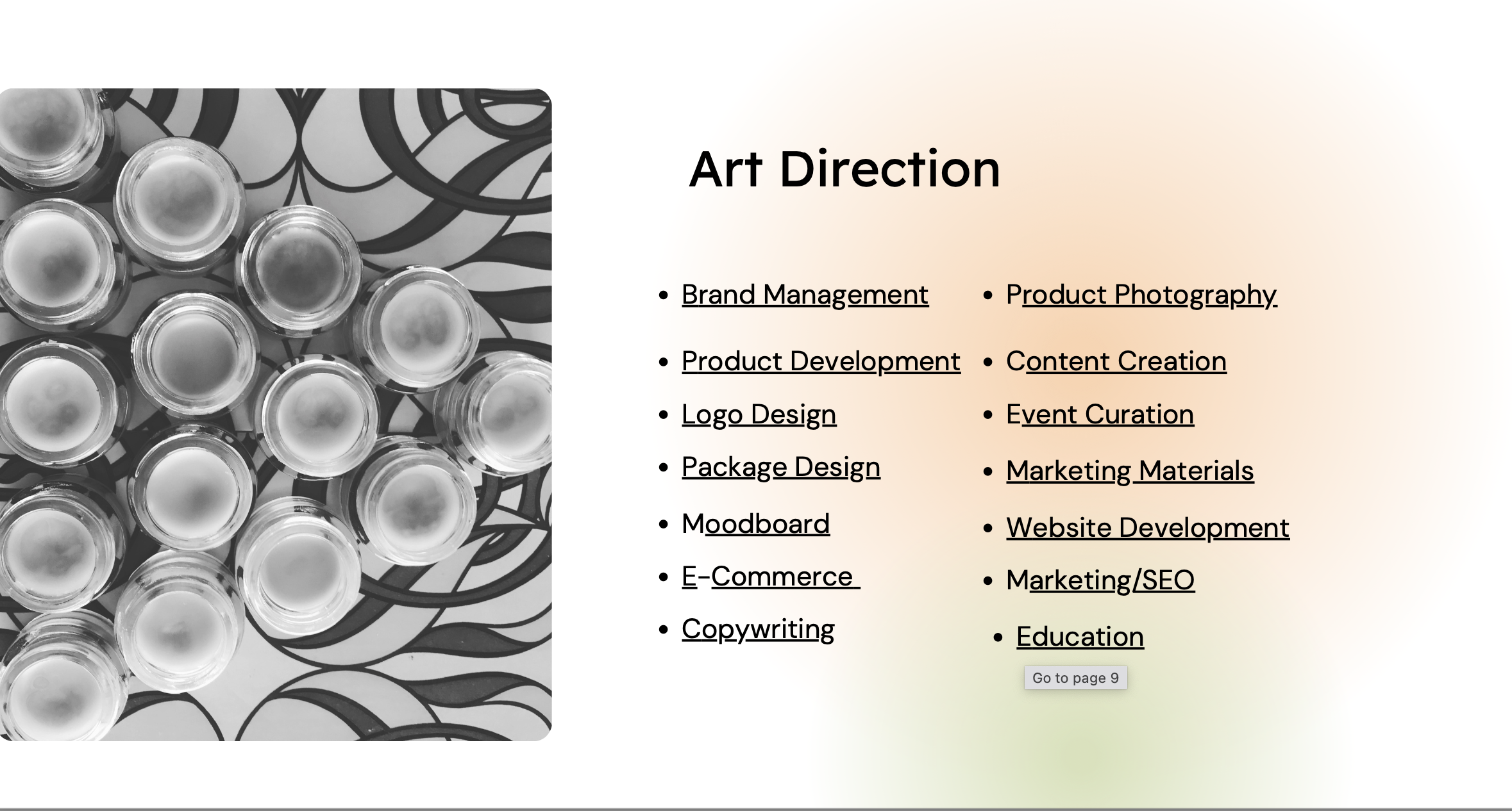
2. Whole scope: This project spanned the full stack: SEO, information architecture, art direction, packaging, copywriting, and photography — a one-person creative and technical pipeline from concept to launch.
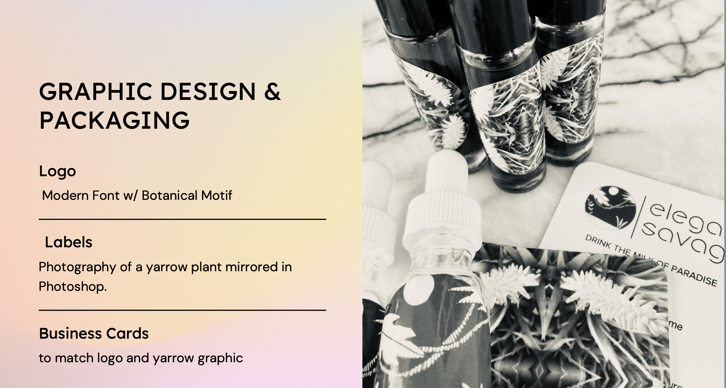
3. Graphics/packaging: Packaging used mirrored botanical photography to create a psychedelic, vortex-like visual signature — modern and fresh, but rooted in nature, to speak directly to a 20s–40s audience seeking both clean.
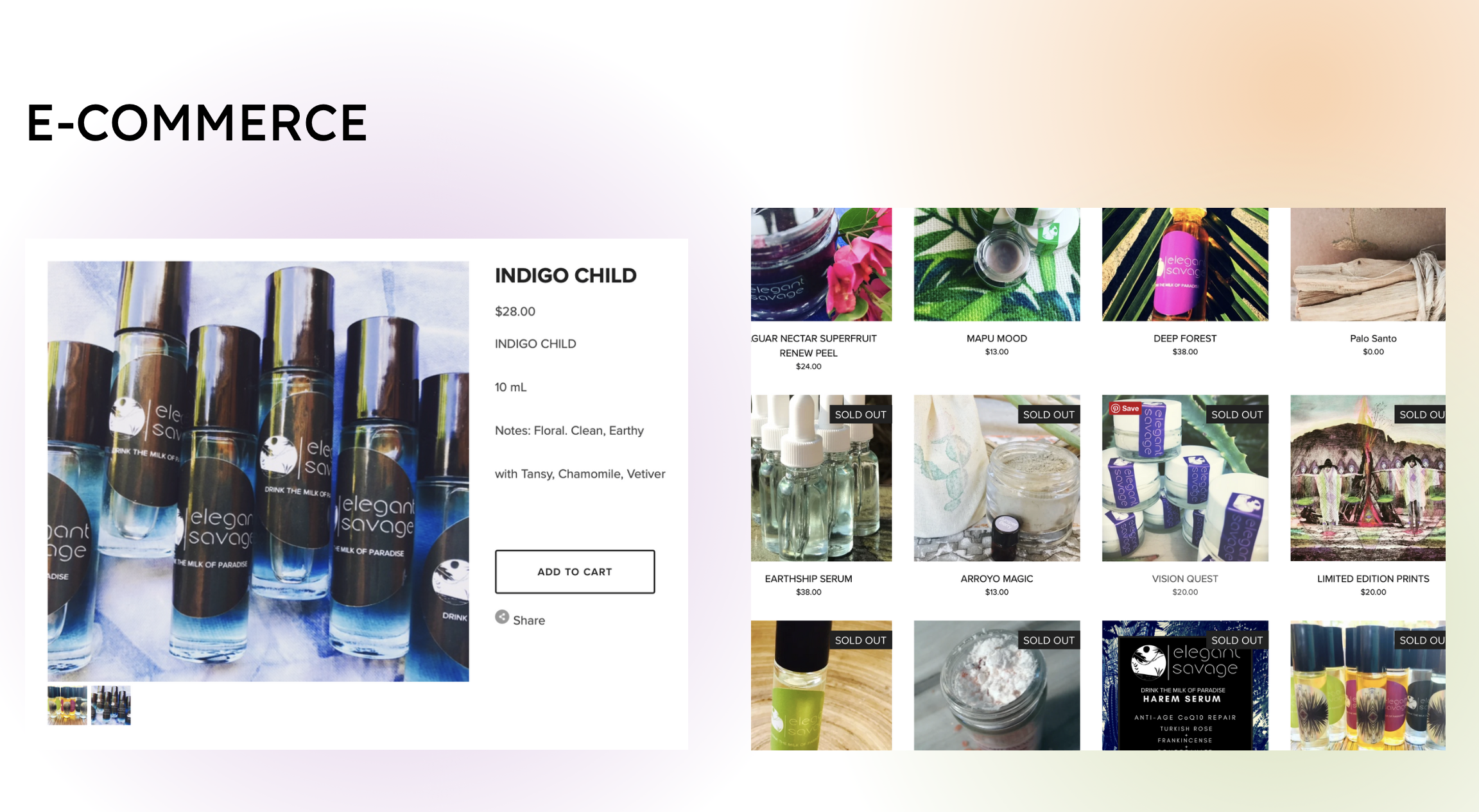
4. E-commerce: The commerce layer was intentionally secondary to the story — purchase was the smallest step in a much longer trust-building journey.
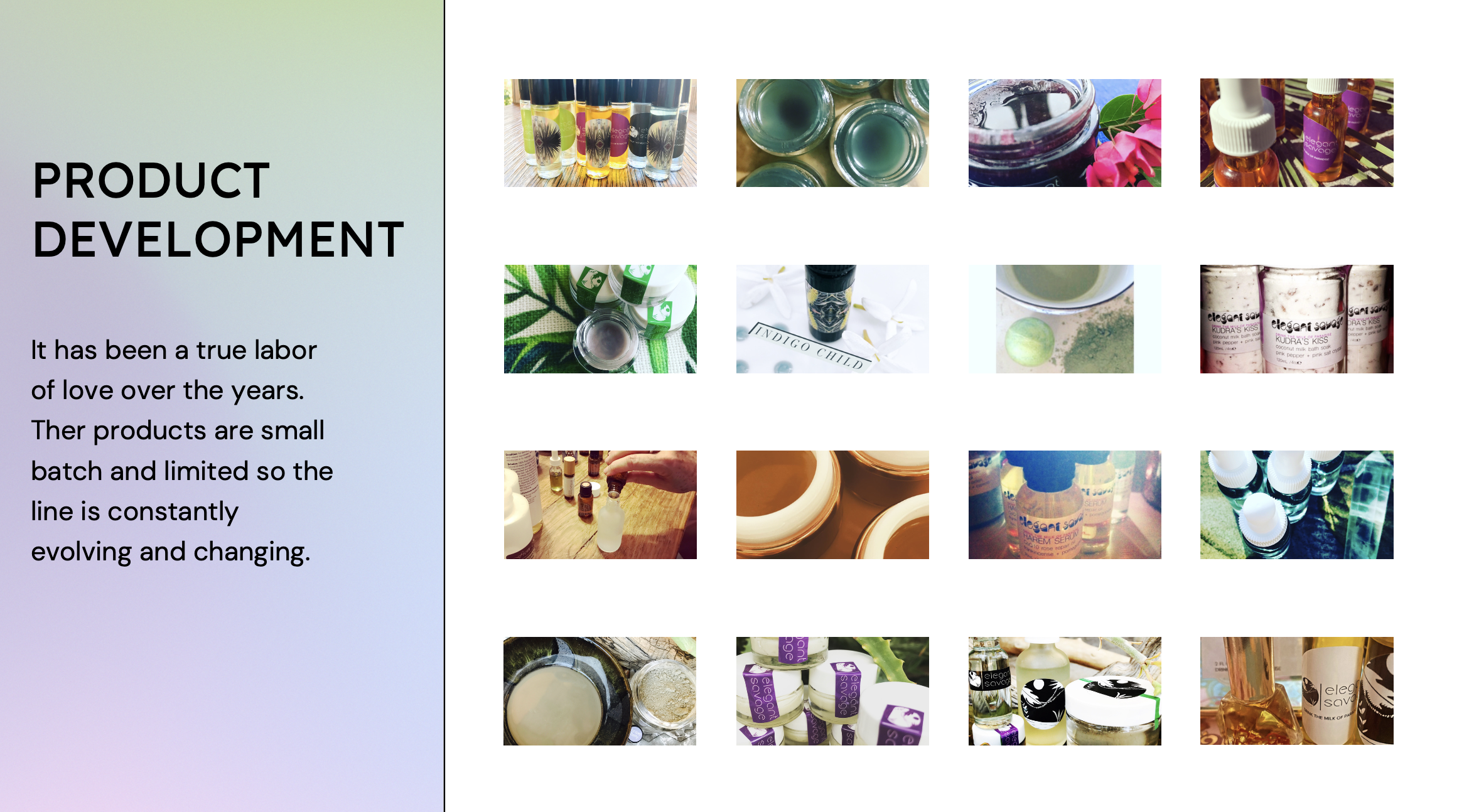
5. Product development: Ingredient selection and formulation prioritized sensory appeal — color, texture, and scent — as much as efficacy, so the products felt as good as the story sounded.
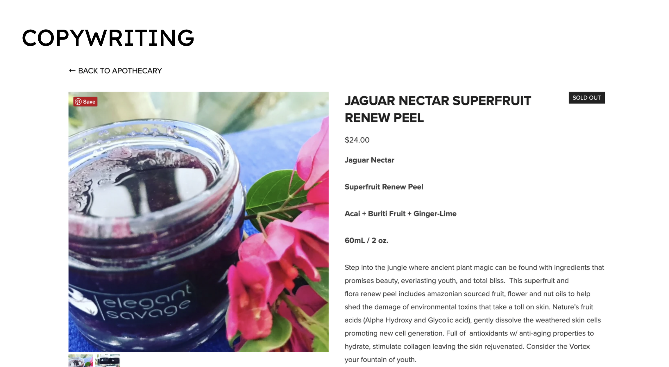
6. Copywriting: Every product description carried the brand's larger narrative, so even a single product page did the work of building belief in the mission, not just describing what was inside the bottle.
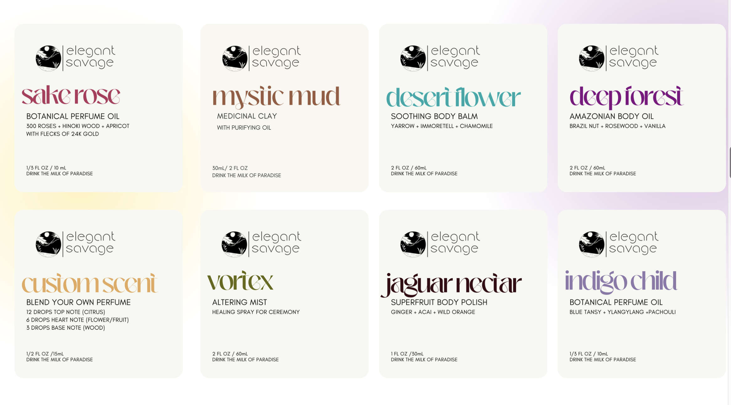
7. Labels: Labels evolved over time as the brand matured — a visual system built to scale across a growing product line while staying recognizably Elegant Savage.
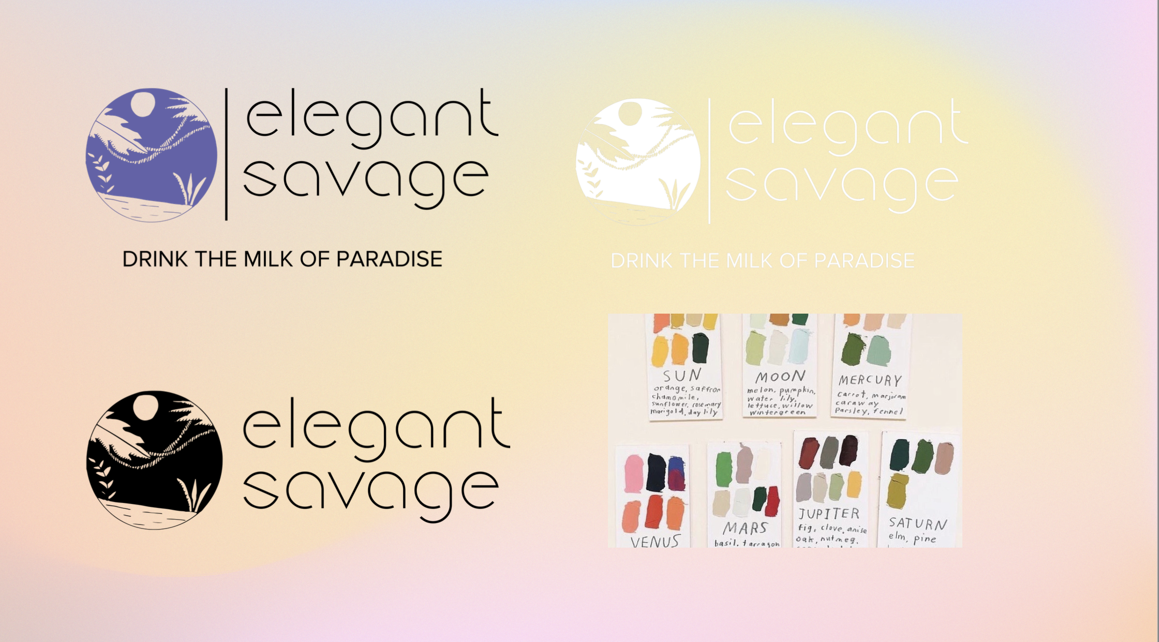
8. Logo: The logo anchored the brand's identity: global, botanical, and intentionally distinct from the clinical look of most beauty brands at the time.
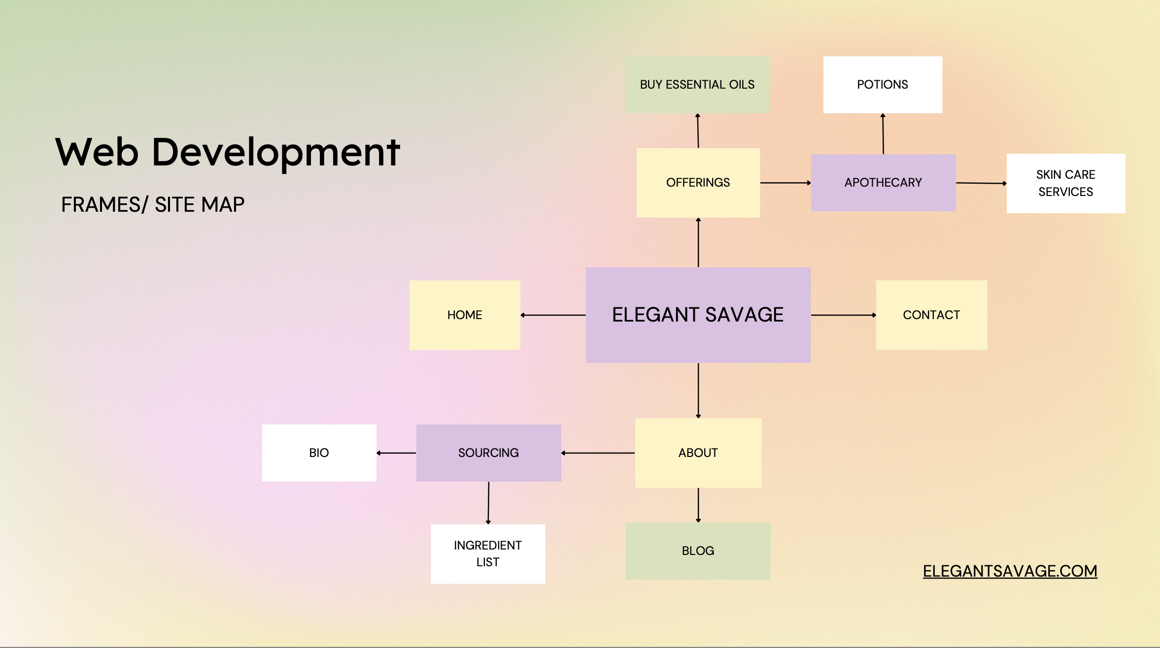
9. Site map: The real user journey wasn't browse-to-purchase — it was discover-to-trust-to-belong. The site's structure reflects education first, transaction second, with product as the entry point into a much deeper relationship with the brand.
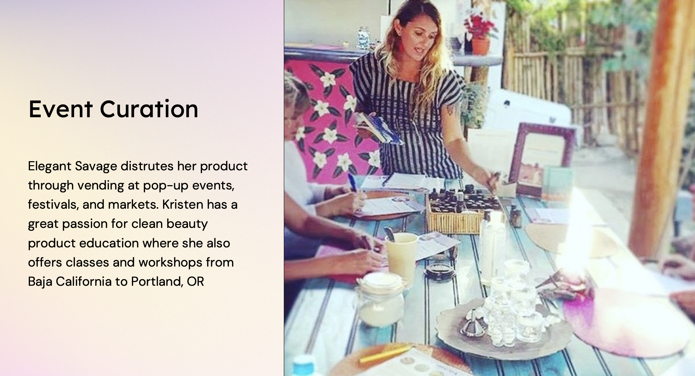
10. Event curation: The brand grew through in-person teaching at festivals and workshops where I taught ingredient education directly. That in-person relationship-building shaped what the website needed to replicate at scale for people who couldn't attend in person.
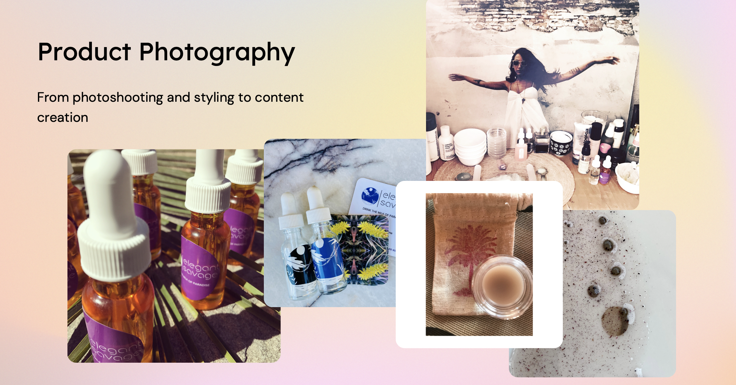
11. Photography: Content photography was curated to feel editorial rather than transactional, reinforcing the brand as a lifestyle and philosophy, not just a product line.
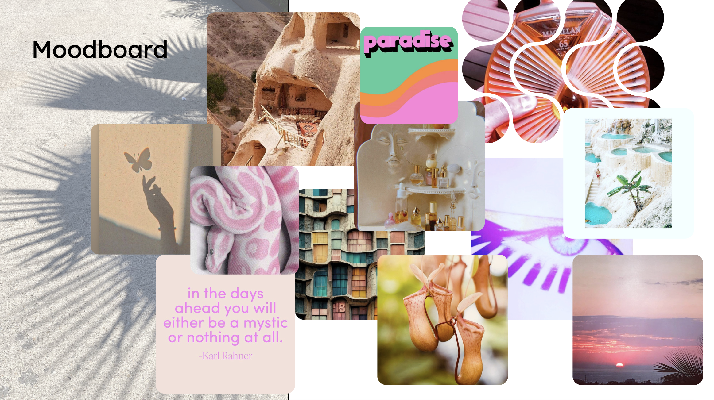
12. Mood board: Early visual direction rooted in botanical, global, and psychedelic influences — the starting point every later design decision traced back to.