

Project: Earth Angel Wellness -Designing for Connection, Not just Services
Role: Sole designer and strategist — brand identity, UX/IA, content strategy, print/digital marketing, and photography direction
Earth Angel Wellness launched in 2018 around a specific idea of who its customer already was, or wanted to be: someone who chooses natural over synthetic, the planet over convenience, kindness and ancient ritual over quick fixes — an "Earth Angel." The hero image, shot by Angel Dawn Photography, had to do the heaviest lifting on the entire site: one true, natural beauty portrait that visitors could see themselves in, signaling belonging before a single word of copy was read.
That identity-first approach didn't replace the site's practical job of getting people to book treatments — it powered it. Every design decision, from treatment copy to the events page to the brand's bold, winged 2018 logo, was built to make booking feel like an extension of who the customer already was, not a transaction with a stranger.
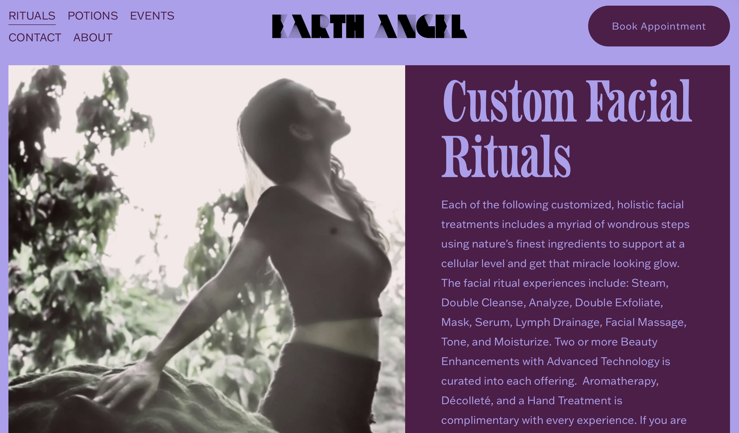
Home : The homepage set the tone immediately: this is a wellness brand built on natural beauty, and connection to nature.

Content creation (mobile/social view) : Content was designed mobile-first for social, since that's where most people would first encounter the brand before ever visiting the site.
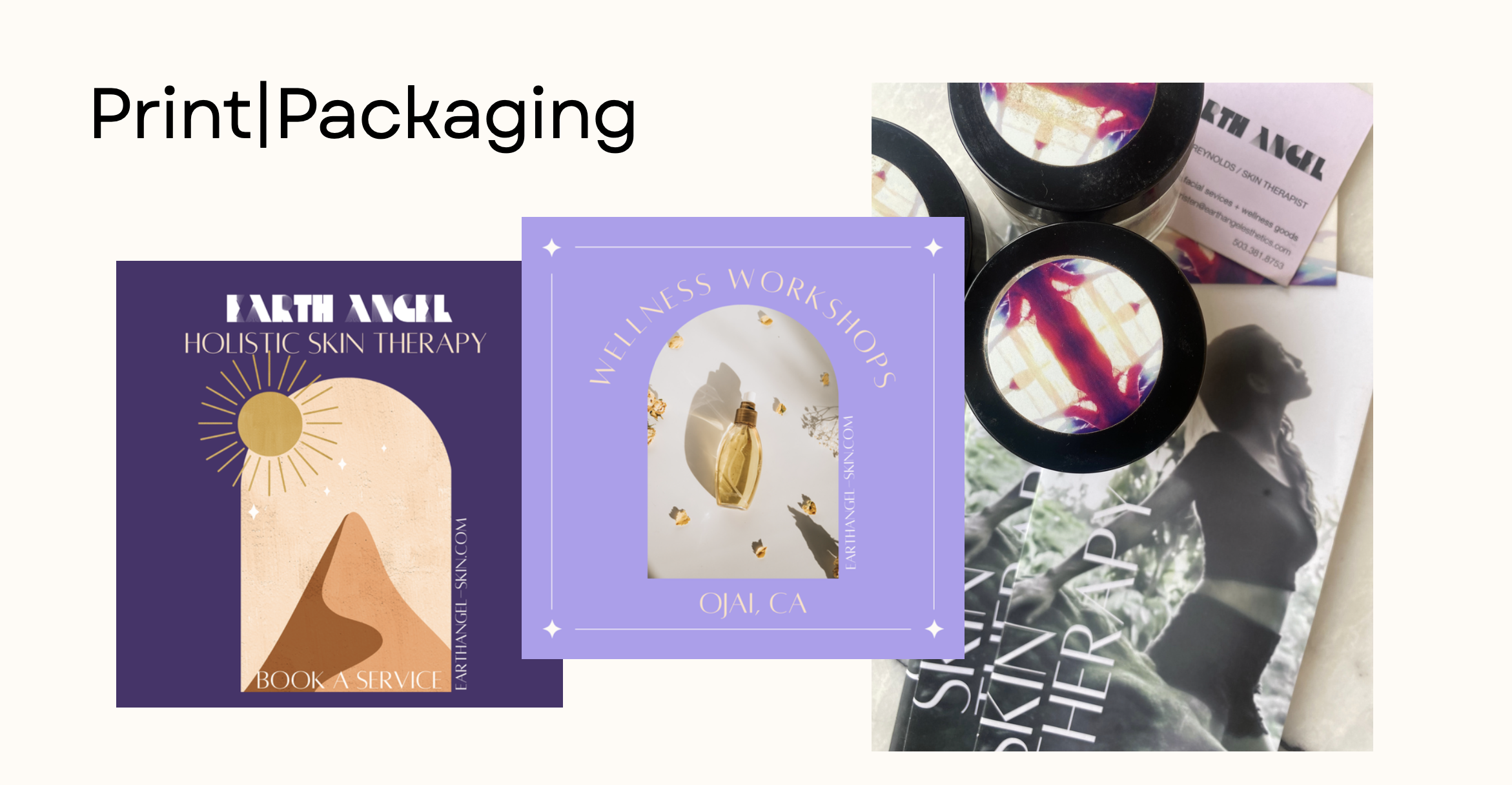
Marketing materials, packaging & print: Brand consistency extended off-screen into print and packaging, so the in-person and digital experience felt like one continuous brand, not two.
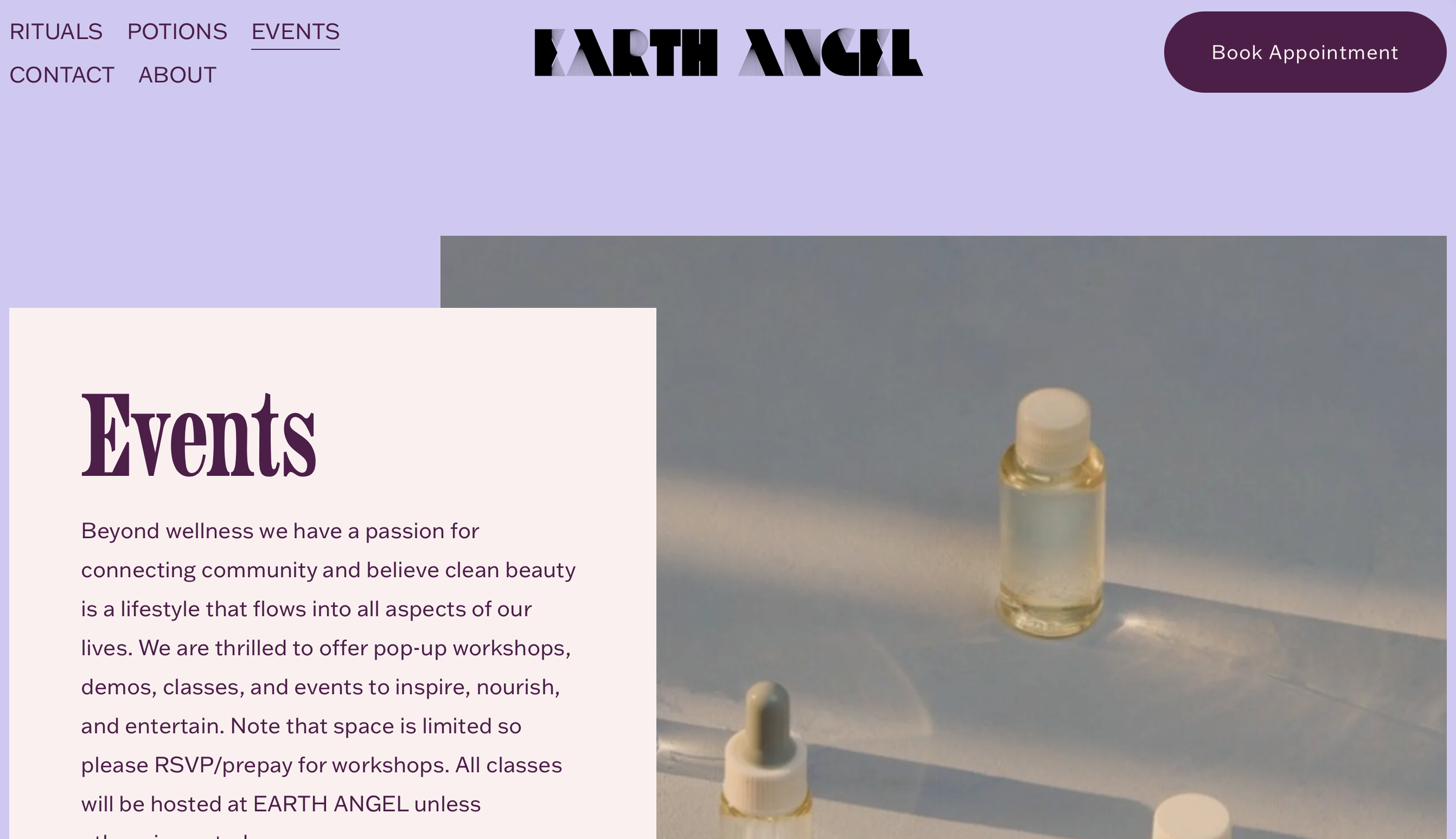
Events page : Community was treated as a core offering, not an add-on — the events page carries equal structural weight to the services pages, reflecting that connection mattered as much as any single treatment.
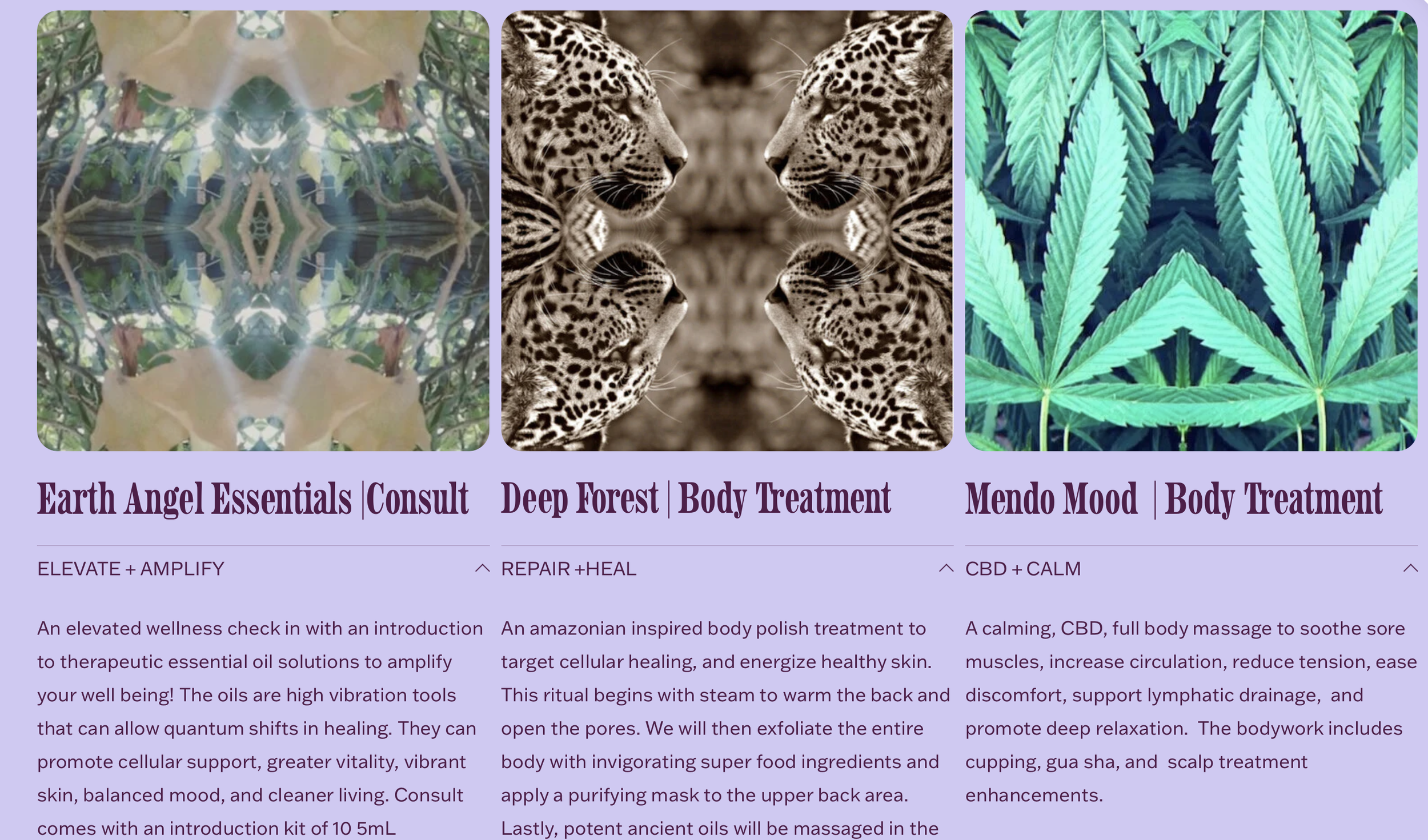
Treatment descriptions : Each treatment description balanced two jobs at once: clear, useful information for the customer, and brand voice that made even a service menu feel curated and intentional.
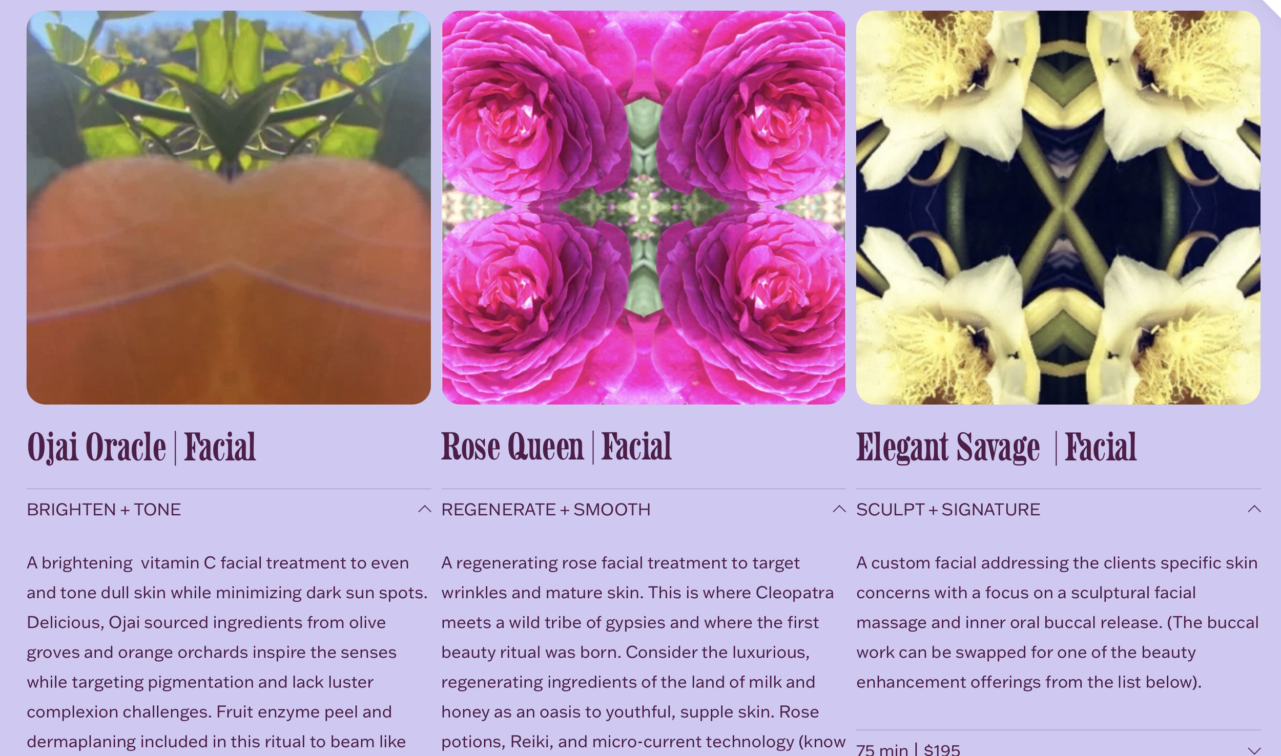
Treatments: Continued
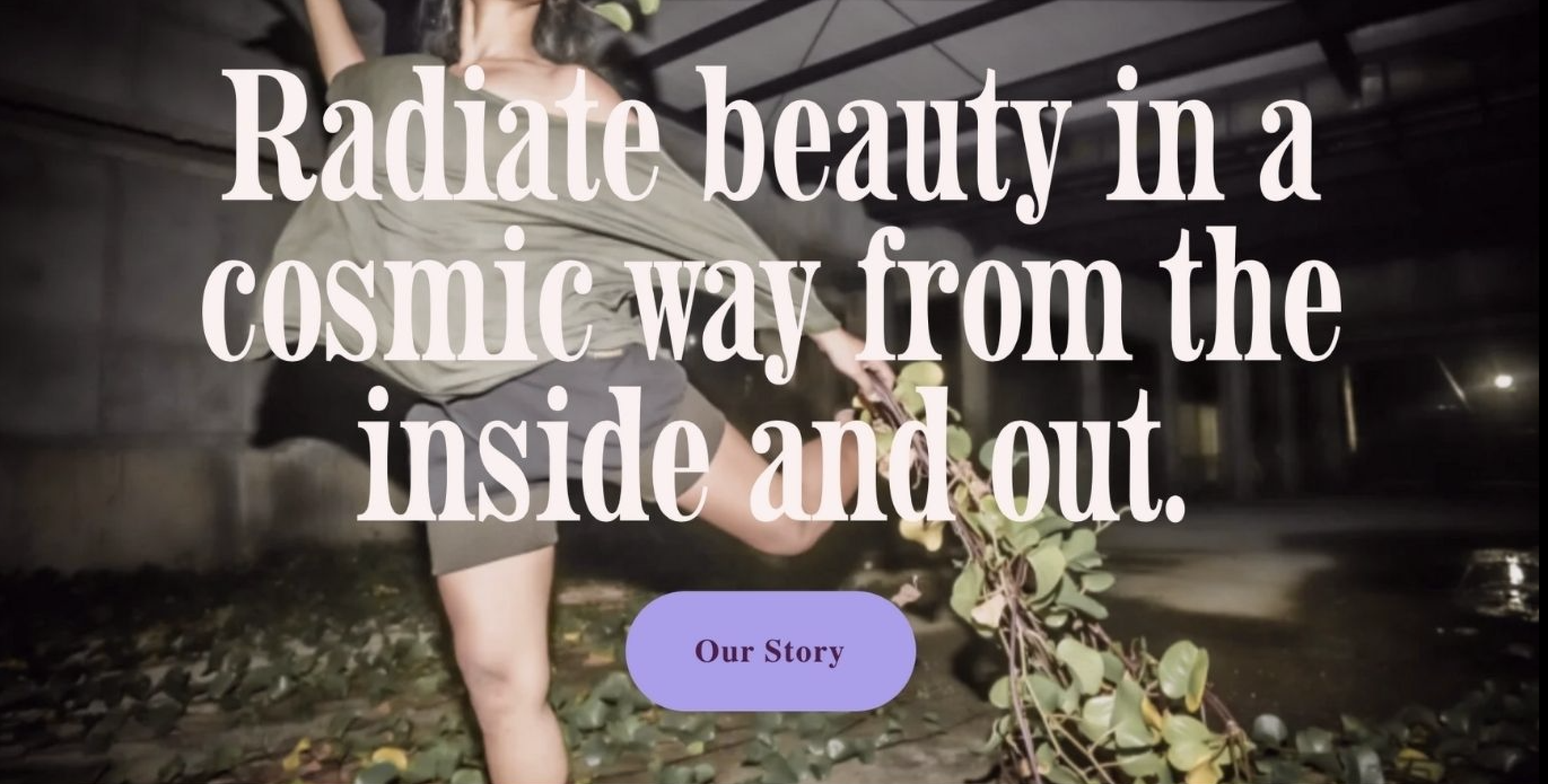
Hero graphic: Photography by Angel Dawn Photography anchored the emotional tone of the site from the first scroll.
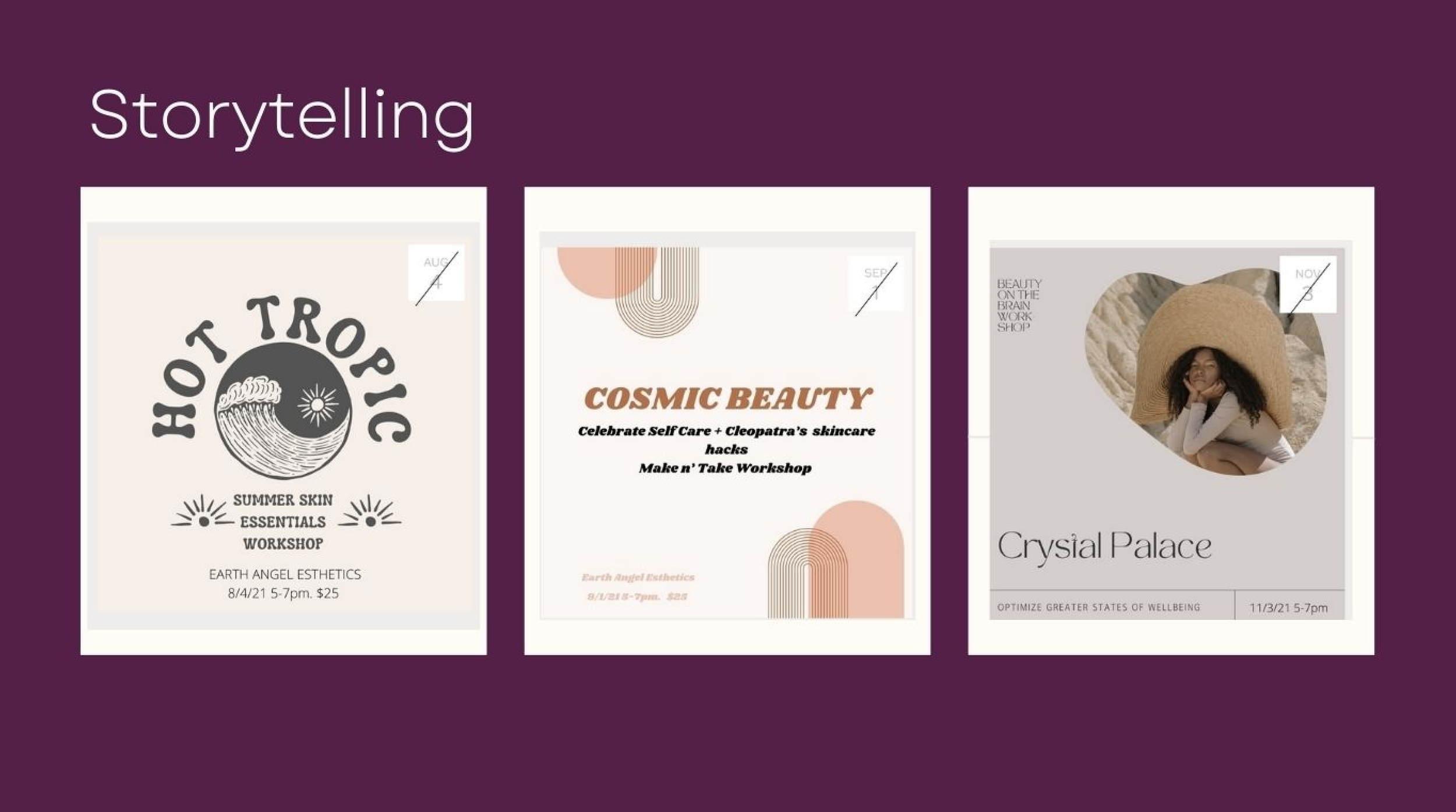
Workshop offerings: Workshops were framed as storytelling, not transactions — each offering description carried a narrative, reinforcing that this was about experience and education, not just a checkout.
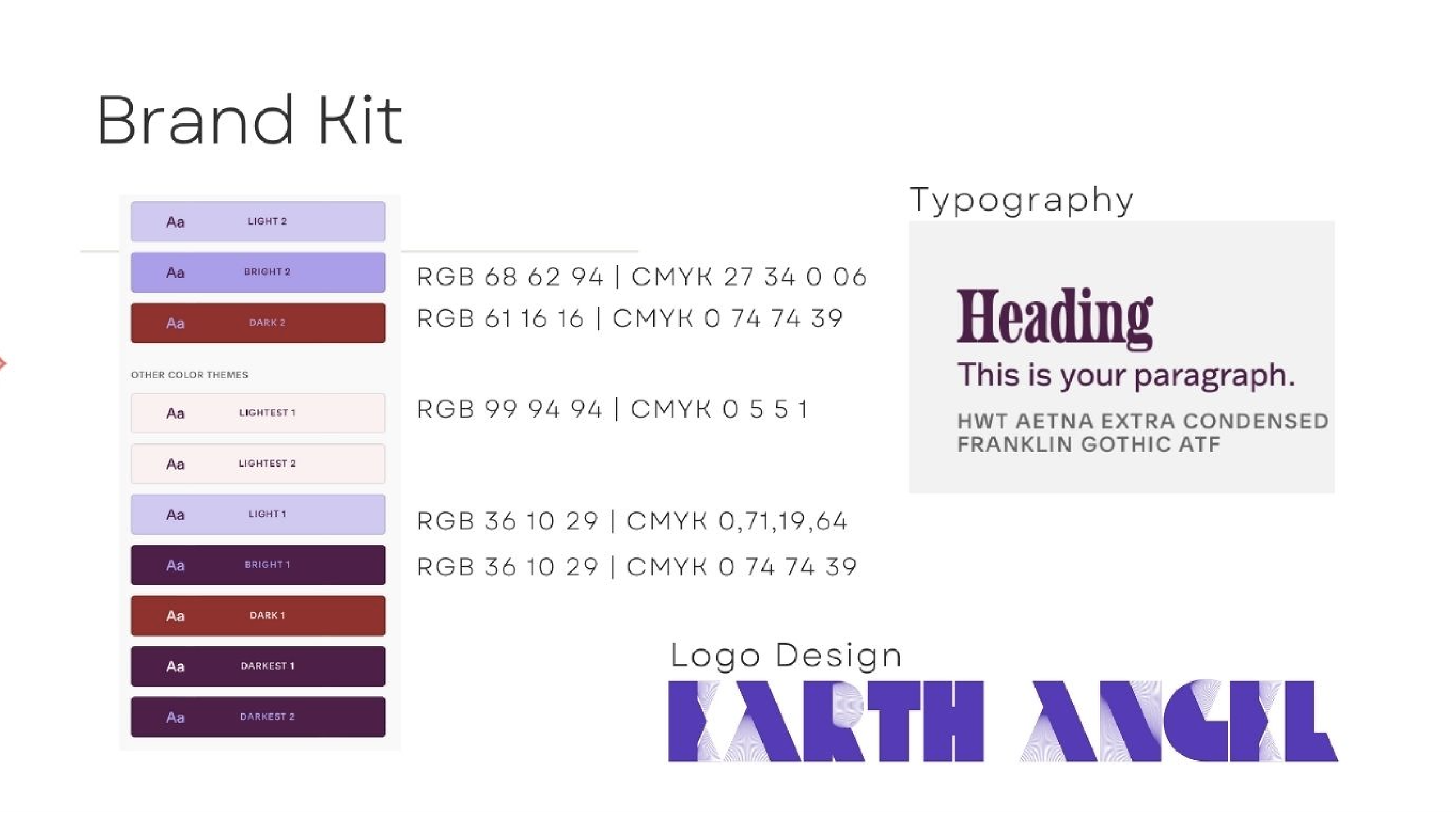
Brand kit : The 2018 logo took a bold, winged design that was ahead of its time for the wellness space, paired with a custom typeface and a palette of luscious purples, deep reds, and light lavenders — colors pulled directly from nature and the treatments themselves.
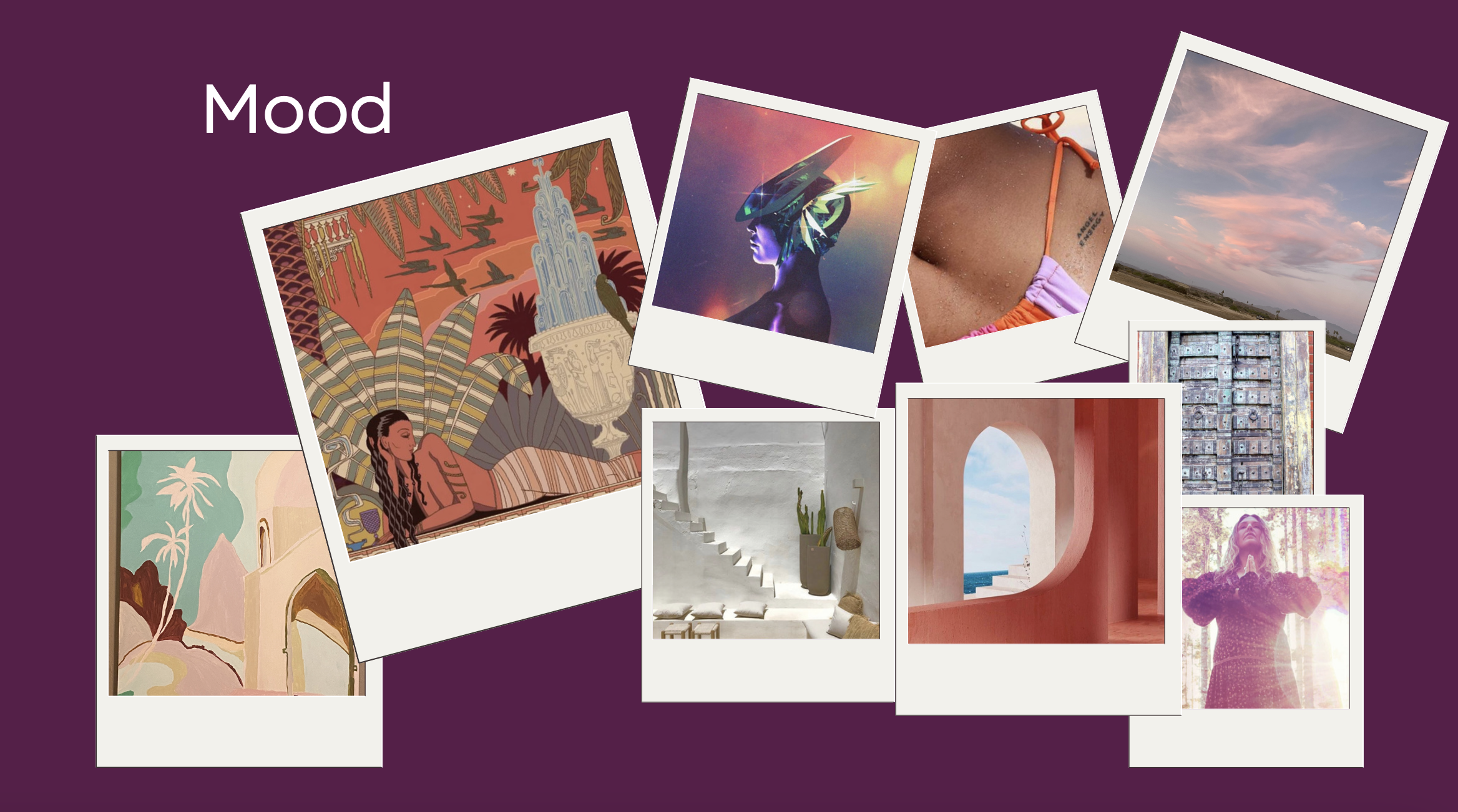
Mood board "Early visual direction rooted the brand in nature-inspired color and texture, setting the foundation every later decision was measured against."